2021. 6. 15. 16:37ㆍ개발을 파헤치다/Android
안드로이드 개발을 하다 보면 다양한 Custom 레이아웃을 만들 상황이 생기게 됩니다.
이번에는 원 모양의 상태바(Circular Progress bar)를 만드는 방법을 살펴보겠습니다.
굉장히 쉽고 따라하기 편하게 정리해놓았으니 아마 보고 따라만 하셔도 15분 정도면 충분히 구현 가능하다고 생각합니다.
자, 그럼 시작해볼께요.
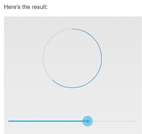
Circular Progress bar를 구현하면 이런 모습이 나오게 되는데요.
구현 순서는 아래와 같습니다.
1. 원형 모양의 배경(Background) 구현하기
2. Progress bar로 쓸 원형 모양 구현하기
3. Custom Progress bar 레이아웃 구현하기
하나씩 한번 살펴보도록 하죠.
배경 구현하기
가장 먼저 원형 모양의 배경을 만들어줍니다.
Progress bar가 진행되면서 게이지가 차오르는 것 같은 느낌을 주기 위해서인데요.
배경이 있는 것이 훨씬 보기 편하고 디자인상 깔끔한 느낌을 줍니다.
안드로이드 프로젝트의 res 디렉터리 밑 drawable 디렉터리에 xml 파일을 생성하고
아래 내용을 구현해주시면 됩니다.
<?xml version="1.0" encoding="utf-8"?>
<shape
    xmlns:android="http://schemas.android.com/apk/res/android"
    android:shape="ring"
    android:innerRadiusRatio="2.5"
    android:thickness="5dp"
    android:useLevel="false">
    <solid android:color="@color/menu_off"/>

</shape>
Progress bar 구현하기
다음으로 Progress bar로 쓸 모양을 만듭니다.
당연히 원 모양으로 만들어야겠죠?
원의 가장 상위 지점(270도 지점)에서 시작하여 Progress bar가 진행됨에 따라 원 모양으로 그려질 도형을 만드는 과정입니다.
마찬가지로 res > drawable 디렉토리에 xml 파일을 만들고 아래 내용을 구현해주세요.
<?xml version="1.0" encoding="utf-8"?>
<rotate
    xmlns:android="http://schemas.android.com/apk/res/android"
    android:fromDegrees="270"
    android:toDegrees="270">

    <shape
        android:innerRadiusRatio="2.5"
        android:shape="ring"
        android:thickness="5dp"
        android:useLevel="true"
        >

        <gradient
            android:angle="0"
            android:endColor="@color/color_primary"
            android:centerColor="@color/color_primary"
            android:startColor="@color/color_primary"
            android:type="sweep"
            android:useLevel="false"/>

    </shape>

</rotate>
Custom Progress bar 레이아웃 구현하기
이제 Progress bar 레이아웃에 아까 만든 배경과 Progress bar를 설정해줍니다.
background 속성에 처음 만들었던 배경 모양을 설정하고,
progressDrawable 속성에는 위에서 구현한 progress bar를 설정해주면 됩니다.
그러면 어떤 일이 진행됨에 따라 원 모양으로 게이지가 차오르는 Circular Progress bar가 완성됩니다.
<ProgressBar
        android:id="@+id/record_progress_bar"
        android:layout_width="300dp"
        android:layout_height="300dp"
        android:background="@drawable/circular_progress_background"
        android:progressDrawable="@drawable/circular_progress_bar"
        android:indeterminateOnly="false"
        android:max="120"
        android:progress="0"
        app:layout_constraintBottom_toBottomOf="parent"
        app:layout_constraintEnd_toEndOf="parent"
        app:layout_constraintStart_toStartOf="parent"
        app:layout_constraintTop_toTopOf="parent" />
주의해야 할 속성 값들을 살펴볼 텐데요.
- progress : 시작점을 의미합니다. 0으로 설정하면 원의 처음부터 시작됩니다.
- max : 최댓값을 의미합니다. 어떤 일이 진행됨에 따라 setProgress 함수에 값을 계속 바꿔줄 텐데
이 경우 120이 들어가면 원이 꽉 찬 모양이 됩니다. - indeterminateOnly : 이 속성은 현재 무슨 일이 처리되고 있다고 단순하게 알려주도록 하는 값인데요.
true로 설정되면 그냥 progress bar가 반복적으로 표시됩니다. 따라서 특정 일이 진행됨에 따라 Progress bar를 나타내는 경우라면 false로 설정해주는 것이 좋습니다.
이렇게 Custom Circular Progress bar를 매우 간단하게 구현해보았습니다.
그렇게 어렵지 않죠?

'개발을 파헤치다 > Android' 카테고리의 다른 글
| 앱 수익을 위한 필수! Firebase Dynamic Link 사용법 총정리 (1) | 2021.10.20 |
|---|---|
| [안드로이드] Groupie로 확장 가능한 RecyclerView 만들기 (0) | 2021.06.21 |
| Recycler View에 초간단 Paging 라이브러리 적용하기 (0) | 2021.06.09 |
| 안드로이드 R(11)에서 전체화면 구현하기 (2) | 2021.06.03 |
| Firebase로 안드로이드 앱 테스트용으로 배포하는 방법 (0) | 2021.06.01 |